Virgin is the name of one of the largest conglomerates, established in the United Kingdom in 1970. Today the company operates worldwide and has numerous subsidiaries in all the possible business segments. The yearly revenue of Virgin is about 17 billion GBP.
Meaning and history
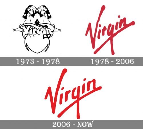
The visual identity of the powerful conglomerate has been redesigned only once during the company’s history. And its logo, which became iconic, is instantly recognizable across the globe and is known even by those who have no idea what the Virgin is.
1973 – 1978
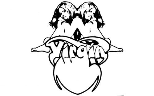
However, the very first logo, designed for Virgin in 1973, was completely different from what we all know today. It was a very stylish and ornate image, created by Roger Dean, a famous artist from the UK.
The logo from the 1970s boasted an image of two Gemini girls sitting back-to-back above the heart-shaped emblem with the “Virgin” inscription on it.
It was not just a logo, but a complete campaign, where the image was placed on different backgrounds and surroundings. It could be monochrome or colorful, scary, or elegant. Roger Dean created a true piece of art.
1978 – 2006
The new era for Virgin visual identity began in 1978 with the creating of the iconic red logotype. The diagonally placed underlined inscription with thick uneven lines became a symbol of power and progress. The first “V” here stands not only for the company’s name but also celebrates Victory.
The rounded lines of the Virgin logo make it look sleek yet friendly and welcoming, while the bloody-red color adds a feeling of passion and dynamics.
The logotype was also used in black, depending on the placement, and in the monochrome palette, it looked more professional and confident, pointing on the corporate character of the company and its expertise in the business.
2006 – Today
The changes the Virgin logo has undergone in 2006 can not be called an actual redesign, but a modification. The iconic inscription remains the only part of the visual identity, though the lines were cleaned and now the logo looks smoother and more luxurious.
The iconic letter “V” gained thicker lines and became a bit wider, which made the whole nameplate more powerful and solid. The underline is also bolder now, adding a sense of confidence and trustworthiness.
The Virgin logo is a brilliant example of how a simple handwritten inscription can become an iconic symbol, known by people all over the globe. An absolutely timeless design, which looks perfect wherever it is placed.


